Shark Attack Properties
Logo Design
Graphic Design
Shark Attack Properties is a real estate company operating in the Charleston, SC aiming to help make the real estate process easier for their clients. I designed from scratch a logo that they can use to convey their trustworthiness and reliability to their clients and community.

Design process
Understand & Define
Sketch & Decide
Prototype and Validate
Overview
Understand & Define
Starting off the design process, research was performed on the style of modern logos and key factors to consider when designing a logo in general. Once I was confident in the concepts I needed to be familiar with, I started my sketching process.
Sketch & Decide
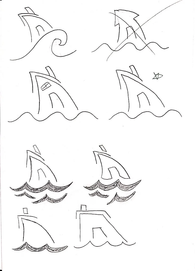
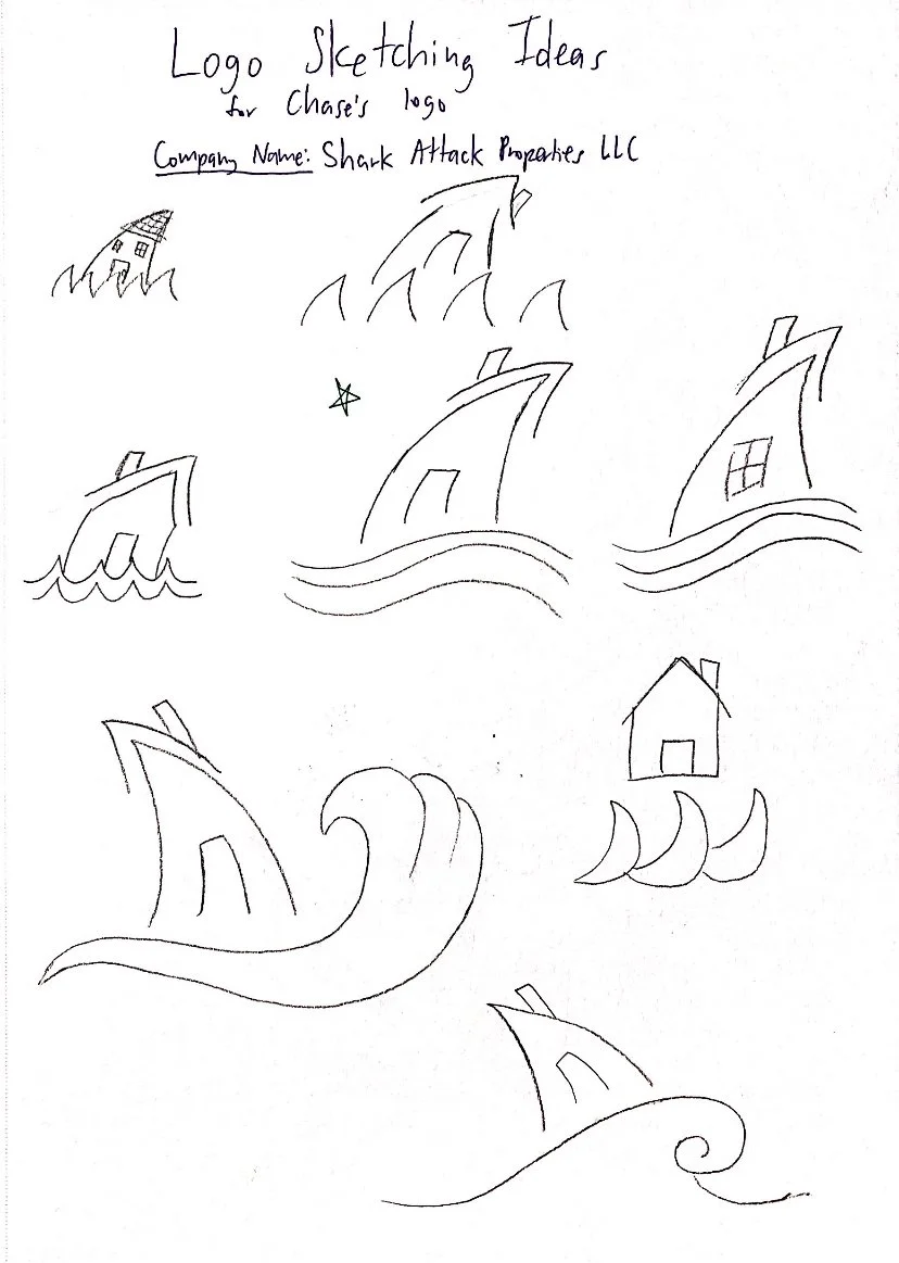
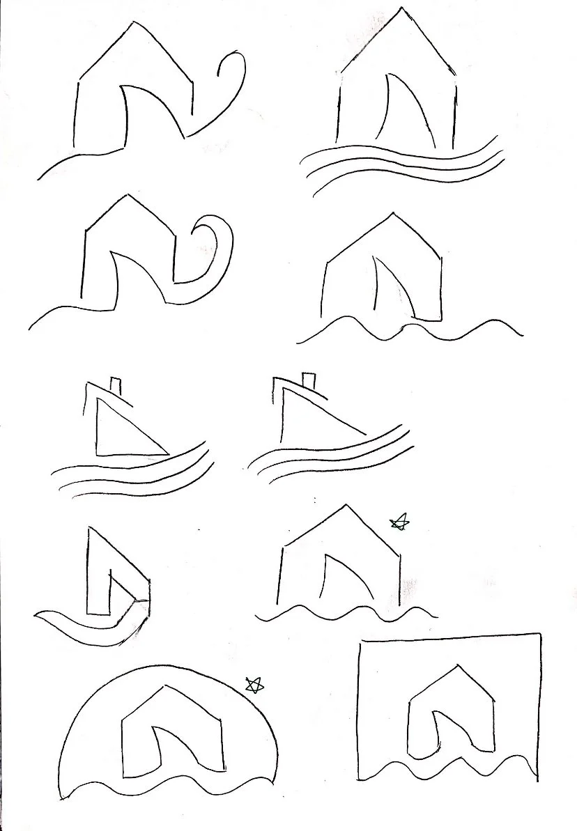
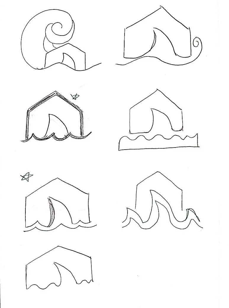
Experimenting with both the client's initial design idea and playing off my own creativity, I sketched several designs. From this I picked out 3 of these sketches to turn into mid fidelity versions of themselves.
Prototype & Validate
I then presented these ideas to my client and after each presentation, more work was done to tweak and polish the designs of their choosing. After a final showcase and small changes, I created the finalized versions of the client's desired logo.

1. Understand & Define
When establishing the direction for this logo, the client's idea was to have a shark fin that looks like a house coming out of the water. Inspired by this, I also did research on different types of modern logos and what elements made them stand out as clean, simplistic, and pleasing to the eye, and got to work on sketching potential ideas.
2. Sketch & Decide
All ideas conceived on regular old pencil and paper
3. Prototype & Validate
Final Outcome
After final discussions, the client decided to go with the left-side logo and I updated the color to be a darker blue to complement another logo that they often used alongside this one. The client was very happy with the final product :)

